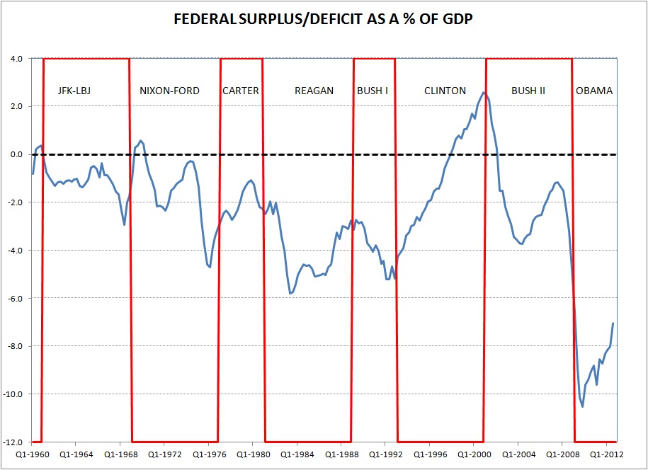
Two nice graphs. One from Angry Bear showing the US deficit/GDP ratio associated with US Presidents since Nixon. The other from Bloomberg last year, before Monti, depicting the Italian public debt in per capita terms, at constant 2011 prices. Comments redundant


